Building a Daily News Sentiment Pipeline with Microsoft Fabric
You know that feeling when you open your news app in the morning and you're hit with a wall of headlines? Too many to actually read, but somehow too important to just ignore completely. That was me until I decided to give this news sentiment pipeline a shot.
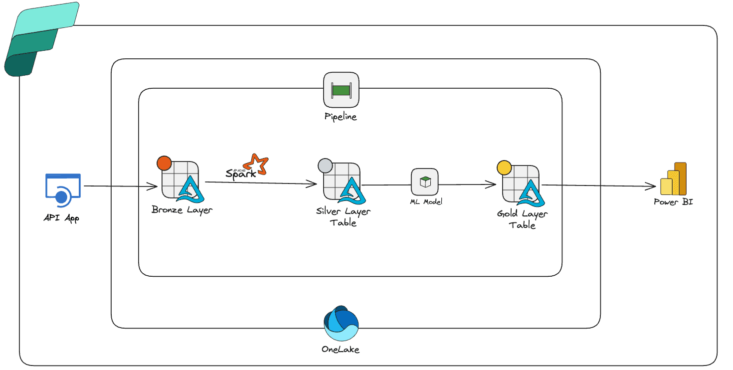
So I started by researching and building a solution in Microsoft Fabric—an automated pipeline that grabs daily news headlines, figures out if they're positive, negative, or neutral, and serves it all up in a clean dashboard. No more drowning in headlines, no more wondering if today's news is particularly doom-and-gloom or surprisingly upbeat.
My Plan
Before diving into the technical stuff, I laid out five clear goals for this project:
- Automated ingestion: Pull daily headlines from a News API.
- Data transformation: Convert that messy JSON response into clean, structured data
- Sentiment analysis: Use machine learning to figure out if each headline is positive, negative, or neutral
- Smart updates: Handle new data without creating duplicates.
- Visual insights: Build a Power BI dashboard that shows me the daily news mood at a glance

Step 1: Getting the Data In (The Bronze Layer)
The first challenge was getting those headlines into Fabric reliably. I set up a REST connection pointing to the News API's /v2/top-headlines endpoint. The Copy Data activity does exactly what it sounds like: fetches the raw JSON response and drops it straight into a Lakehouse Files as latest-news.json area. This became my bronze layer—the raw, untouched data landing zone.


I learned the importance of keeping a bronze layer the hard way in previous projects. It acts as a safety net—if something goes wrong downstream, or if I want to reprocess the data differently later, I always have the original feed to fall back on. It's one of those things that seems unnecessary until you really need it.

Additionally, using pipeline parameters turned out to be really helpful for flexibility—I could easily switch between categories (I chose technology because, well, it's what I'm interested in) or update the API key without touching the pipeline logic.

Step 2: Making Sense of Nested JSON (The Silver Layer)
This is where I ran into the main challenge. The JSON response wasn't ready to use—it had nested arrays and needed some flattening. It was time to pull up a Fabric Notebook.
The main challenge was the articles field, which contained all the headlines in a single nested array. Using PySpark's explode function, I turned each article into its own row. Then came the extraction—pulling out title, description, URL, image, source, and publication date into separate columns.


I also spent time defining a proper schema and reformatting the date_published field into a consistent dd-MMM-yyyy format. Inconsistent date formats have caused me headaches in past projects, so I wanted to get this right from the start.

The key piece I needed to figure out was incremental loading. I added a Delta Lake MERGE statement that compares incoming rows with existing ones using the URL as a unique key. If a row changed, it updates; if it's new, it inserts. This follows the Slowly Changing Dimension Type 1 pattern, and it keeps my dataset fresh without creating a duplicate nightmare.
By the end of this step, I had a clean, structured table of headlines ready for the fun part—adding some intelligence.

Step 3: Adding Sentiment Analysis
Now came the part I was most curious about: sentiment analysis. This is where Microsoft Fabric's built-in SynapseML package really helped me out.
I configured the AnalyzeText transformer to look at the description column and classify each entry as positive, negative, or neutral. The whole thing was surprisingly straightforward—just a few lines of configuration, and suddenly my headlines had opinions attached to them.

Just like before, I wrapped the results in SCD Type 1 logic so updates flow in cleanly. The output? A new gold-layer table called tbl_news_sentiment where each row of news isn't just structured data—it has emotional context.

Step 4: Making It All Work Together (Orchestration)
With all the pieces ready, it was time to wire everything together. The pipeline flow is straightforward:
Copy Data → Transform Notebook → Sentiment Notebook
Three steps, one flow. Then I set up a schedule to run this every morning at 6 AM. By the time I start my day, Fabric has already ingested the latest headlines, scored their sentiment, and refreshed the dataset.
It's something about such automations that actually excites me.

Step 5: Turning Numbers into Insights (Power BI Dashboard)
Rows of "positive" and "negative" in a table don't tell you much until you visualize them. So I built a semantic model on top of tbl_news_sentiment and wrote some DAX measures to calculate the percentage breakdown of positive, negative, and neutral headlines.

Kept things simple with the dashboard:
- Three big numbers at the top: Daily sentiment breakdown (positive/negative/neutral percentages)
- Headlines table below: Shows actual headlines with source, date, and clickable links
- Date filter: So I can drill into any specific day's mood
Now I can answer the question that started this whole project: "What's the tone of today's news?" And I can answer it in about 5 seconds.

What I Learned Building This
This project started as curiosity—what if I could automate how I consume news and actually measure the emotional tone instead of just skimming headlines? Microsoft Fabric worked really well for this. Having ingestion, transformation, machine learning, orchestration, and reporting all under one roof made the entire build incredibly smooth.
A few key takeaways:
APIs are messy. Flattening and cleaning that JSON response was honestly half the battle.
Incremental logic is essential. Without proper handling of updates and duplicates, my dataset would've been a mess within days.
SynapseML made ML accessible. Sentiment analysis turned out to be just a few lines of config, not the complex infrastructure challenge I expected.
Dashboards bring it all together. All that data engineering work doesn't mean much until you can see the story it tells. The Power BI dashboard makes everything instantly useful.
Closing Thoughts
More than anything, this project reminded me why I love data engineering. You start with raw noise—messy JSON from an API—and by the end, you've built something that tells a clear, actionable story.
Every morning now, I glance at my dashboard and know whether I'm walking into a positive news day or need to brace myself for the latest doom scroll. And honestly? That small bit of context has made my mornings just a little bit better.
That's what I love about data engineering—not just moving data around, but creating solutions that actually improve how we understand and interact with the world around us.